Buttons
You have two button options and each may be modified with a different animation or usage of font family. Additional, we have two buttons available to use in the visual editor.
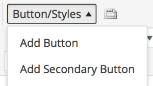
Visual editor screenshot
Select “Add Button” or “Add Secondary Button” to insert into your page.
Primary Button:
This is the primary button style. We have this style available as a shortcode in the visual editor.
<!-- Primary Button with a bounce animation to the right and grey hover. -->
<a class="tcu-button tcu-button--primary tcu-bounce tcu-bounce--right--grey" href="#">Primary Button</a>
You can also change the animation direction to the left.
<!-- Primary Button with a bounce animation to the left and grey hover. -->
<a class="tcu-button tcu-button--primary tcu-bounce tcu-bounce--left--grey" href="#">Primary Button</a>
In this example we have changed the font to be Cabin.
<!-- Primary Button with a bounce animation to the right and grey hover. -->
<a class="tcu-button tcu-button--primary tcu-bounce tcu-bounce--right--grey tcu-cabin" href="#">Cabin Font</a>
In this example we have added an icon to the button. Please refer to the icons page for detailed instructions on how to add icons to your site. Notice that we added custom inline-styles to the icon. You should move these styles into your own CSS file. In order to give the designer more options we have left the styling of the icons up to the developer.
<!-- Let's add an icon to our button -->
<a class="tcu-button tcu-button--primary tcu-bounce tcu-bounce--right--grey" href="#">Read More <svg style="fill: #FFFFFF; height: 30px; width: 30px; vertical-align: top;"><use xlink:href="#circle-next-arrow"></use></svg></a>
Secondary Button:
Secondary button
<!-- Secondary Button with bounce animation to the left and grey hover -->
<a class="tcu-button tcu-button--secondary tcu-bounce tcu-bounce--right--grey" href="#">Secondary Button</a>
In this example we have changed the font to be Moonface.
<!-- Moonface Font -->
<a class="tcu-button tcu-button--secondary tcu-bounce tcu-bounce--right--grey tcu-moonface" href="#">Moonface Font</a>
In this example we have changed the animation direction to the left and the hover color to purple.
<!-- Secondary button with bounce animation to the left and purple hover -->
<a class="tcu-button tcu-button--secondary tcu-bounce tcu-bounce--left--purple" href="#">Secondary Button</a>